Print Data Part 3 – Gaining Insight
This trilogy of blog posts has covered how you can collect, report, and analyse your print data from multiple sources. In Part One, we discussed data collection and how to avoid black holes in your print data. In Part Two, we talked about report production, scheduling, and delivery for tasks such as billback, cost allocation and basic management summary reports. In this final instalment, we will show how data analytics can help to visualise data and provide further insight.
To date, we have discussed collecting and reporting on print data using methods typically used by print management solutions whilst ignoring how this information is stored and processed. Such reporting solutions are typically based on SQL databases, which are used for both the operation and reporting functions of the software. This may lead to a potential conflict between reporting and printing activities, especially in large systems where reports may take a very long time to run. The last thing you want, whilst running your favourite monthly reports, is to discover you have slowed down or have stopped printing!
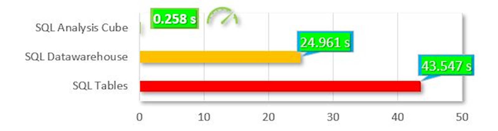
An enterprise may generate tens of millions of print events per year and may want to store two hundred million print events or more over a five-year period. To effectively analyse reporting data at this scale, one must consider optimizing the database design and reporting capabilities. To give an idea of the difference in performance of the different options available, the following chart shows the processing and rendering times for the same five million record data set in three different formats. The red bar on the bottom shows data stored in standard SQL tables; the yellow one shows a Data Warehouse “star” schema; and finally, the green one at the top shows data processed in an SQL Analysis “Cube.
This striking graphic introduces a new concept to our discussion: OLAP Cubes. An OLAP (OnLine Analytical Processing) Cube is a data structure that allows very fast analysis of data according to the multiple dimensions that define a business problem. For example, a multidimensional cube for reporting print data might be composed of six dimensions: Username, Department, Location, Print Type, Month, and Year against measures of Total Cost and Total Document Impressions.
The arrangement of data into Cubes overcomes a limitation of relational databases, which are not well-suited for near-instantaneous analysis and display of large amounts of data. Although many report writing tools exist for relational databases, these tend to be slow when the entire database must be summarized. They also present great difficulties when users wish to re-orient reports or analyse according to different, multidimensional perspectives, aka, Slices. The use of Cubes facilitates this kind of fast end-user interaction with data.
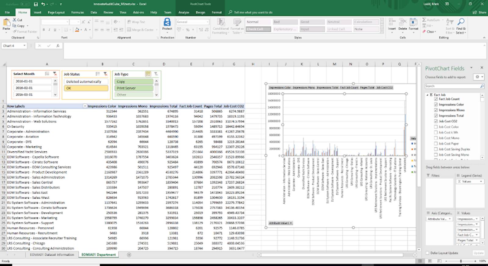
OLAP Cubes are not just a quick means of gleaning summary information from your tabular reports. When coupled with an Excel PivotTable, they can provide extremely powerful and blisteringly fast analysis of your data for anyone with reasonable Excel skills. Data Slicers, filters, and Pivot Charts can be used to enhance the presentation of this data within seconds. Access to the data is granted by the Analytics engine using Active Directory objects and is completely separated from SQL Server permissions.
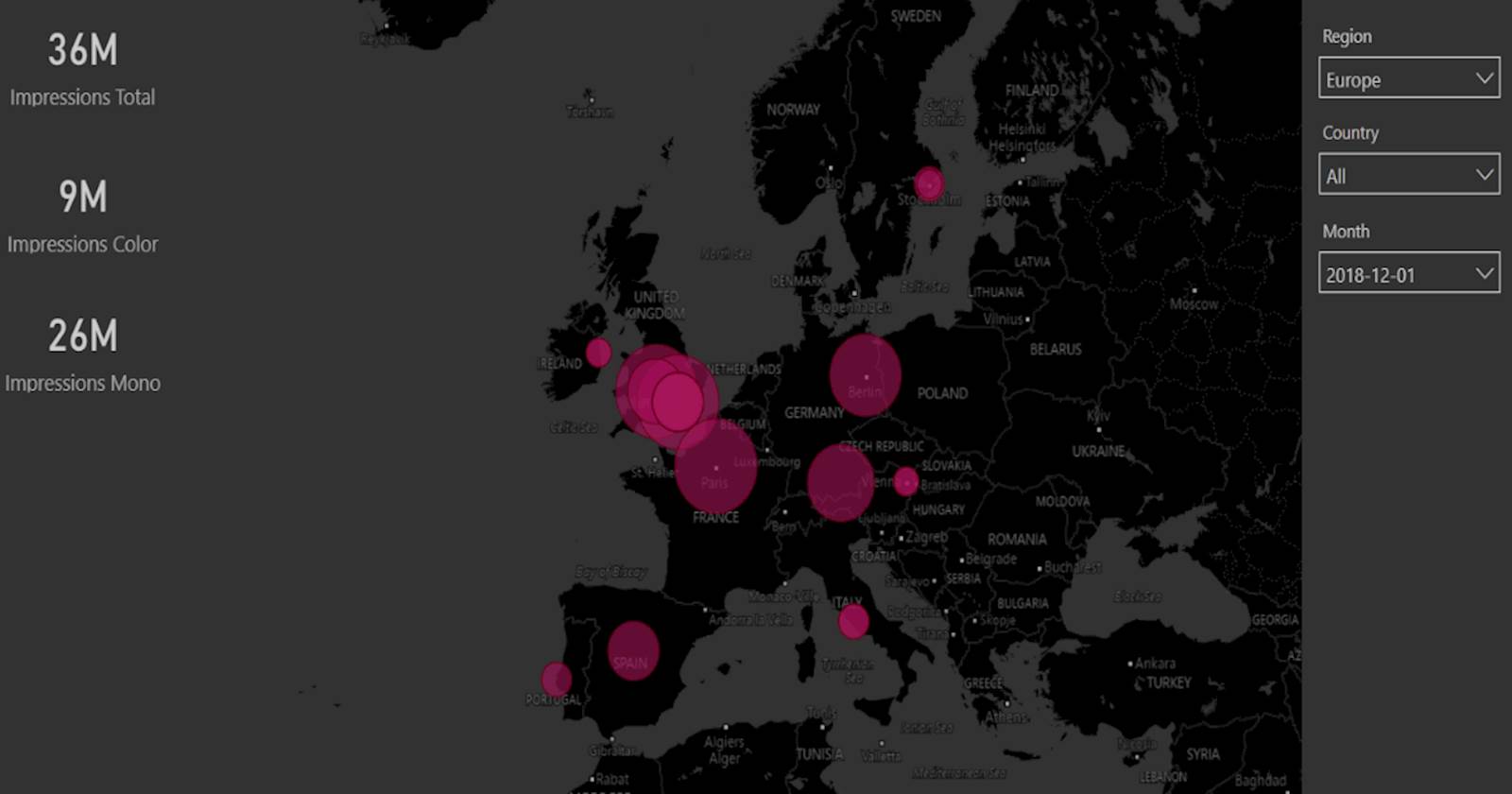
Presenting your data graphically can provide real insight of your data at a glance. Combined with the speed of OLAP cube processing, you have the power to effortlessly explore your printing use in an interactive manner. The following example using Power BI shows a dynamically generate map, where the data points reflect the total print volumes with filters for Region, Country and Month. The map allows the user to zoom and pan whilst the Region and Country selector filters the results according to the user’s interest. Hovering over a heat spot will reveal more information.
The Power BI facility allows the creation of dynamic dashboards, with a combination of components displaying data important to your organisation. Individual tiles can act as filters for the whole set.
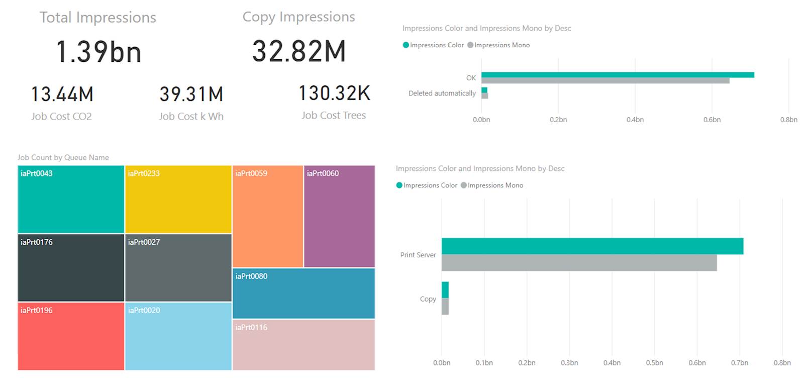
These tools allow you create customised dashboards relevant to the audience using a multitude of “visuals.” As an added bonus, there is a whole new world of custom visuals such as Infographic designers, Sparklines and Sankey charts to explore. The old adage that a picture is worth a thousand words could easily be updated to something like “a dashboard is worth a thousand tabular reports.” Unless, of course, you are an accountant. Microsoft have made it easy to dip your toe into the world of Business Intelligence with Power BI, but there are many other tools available (e.g., Tableau), which offer OLAP integration.
Depending on your viewpoint, it is either with regret or relief that we have come to the end of this series of Blog posts. Hopefully these articles have provided some inspiration for you to find out how printing really works in your organisation and enable you to provide tailored reporting which will add real value and insight.
TL;DR – standard tabular reports are fine, but for true analysis, you can do a lot better. Ask LRS… we can help.